Website Customer Experience: How to Deliver a Caring, Personable Online CX

UPDATED MAY 2026
PART OF OUR CUSTOMER LOYALTY STRATEGY RESOURCE HUB
A website’s customer experience is the result of dozens of small decisions about strategy, content, design, and trust, and it’s often the first real interaction a customer has with a brand. To improve customer experience on a website, start with content strategy that maps to what your audience needs at each stage of their decision, then let design carry the rest of the load. The choices that matter most include simplicity and white space, grouped information, intentional imagery and color, mobile-first design, clear calls to action, visible trust signals, and a foundation of accessibility and speed. Done well, a strong website customer experience builds trust before the first sales conversation and keeps customers coming back long after the initial visit.
Most of us spend a frankly embarrassing amount of time online. Shopping, scrolling, comparing, researching that one big purchase we keep talking ourselves into. Of all the websites you visited this week, how many left you feeling like the company on the other end was paying attention?
That feeling, or the lack of it, is website customer experience at work.
It’s the emotionally squishier sibling of UX (user experience), and it’s the part that makes someone trust your company enough to fill out the form, click the buy button, or come back next week. With AI-driven personalization in nearly every corner of the web now, the bar for what feels like a “good” website experience has moved. People expect more, and they spot lazy, generic, or vaguely creepy attempts at personalization from a mile away.
So, how do you improve customer experience on a website without crossing into uncanny territory? That’s what we’ll walk through here.
Why Website Customer Experience Matters More Than It Used To
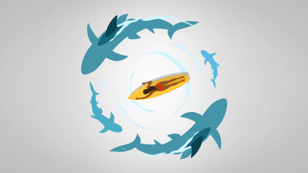
There are over a billion websites live on the internet right now. Many are pretty terrible. Some are abandoned, some are bloated with pop-ups, and a surprising number still have not figured out mobile. Standing out in that pile takes more than a clean design and a contact form.
Here’s the part that gets overlooked: your website is often the first real interaction a customer has with your brand. Before the sales call, before the email exchange, before they’ve talked to a single human at your company, they’ve already formed an opinion based on how it felt to land on your homepage. If that experience is clunky or slow, they’re gone – and they probably won’t tell you why.
A few stats worth noting:
- 52% of consumers say they stopped using or buying from a brand because of a bad experience with its products or services, and another 29% stopped because of poor customer experience online or in person (PwC’s 2025 Customer Experience Survey).
- 70% of executives admit customer expectations are evolving faster than their company can adapt (PwC’s 2025 Customer Experience Survey).
- Customer-obsessed companies report 41% faster revenue growth, 49% faster profit growth, and 51% better retention than companies that don’t prioritize CX (Forrester’s 2024 US Customer Experience Index).
Translation: the website experience you’ve been treating as a marketing checkbox is actually one of the highest-leverage assets your business has.
Build Your Website Customer Experience on Strategy First
The fastest way to build a bad website is to start with the design. A site that delivers a real customer experience starts somewhere else: with a content strategy that maps to what your audience needs at each stage of their decision. Once you know that, the design has a real function.
Here’s what to do.
1. Know your audience (like, really know them)
Most brands think they know their audience. Most brands are guessing.
Knowing your audience means understanding what they’re searching for, what mindset they’re in when they land on your site, and what they need to feel confident enough to act. Someone visiting a healthcare site at 2 a.m. is in a different headspace than someone comparing B2B software vendors on a Tuesday afternoon. Your content should meet them where they are.
A few questions to answer before you write a single page:
- What are they trying to accomplish in this visit?
- What do they already know, and what do they still need?
- What’s the emotional state behind the search?
- What would make them trust you in the first ten seconds?
If you can’t answer these, the rest of your strategy is pointless.
2. Make the path obvious
Your visitors are busy. They’re scanning, not reading. They want to find what they need and move on with their day.
That means clear navigation, a logical content hierarchy, and a path to contact you that takes two clicks, not seven. If a customer has to hunt for your phone number or guess where your services live in the menu, you’ve lost them. There’s no such thing as over-communicating here. The brands that win the customer experience battle make each next step beyond obvious.
3. Write for scanners first, readers second
Almost nobody reads a webpage start to finish. They scan headers and skim the first sentence of a paragraph. They can decide in seconds whether to keep going.
So, write for that reader. Use clear headings, short paragraphs, bold the phrases that matter, and break up dense ideas with bullets or visuals. If a visitor can scan your page and walk away with the gist, you’ve done your job. If they want to dig deeper, the detail is there for them.
8 Design Choices That Shape Your Website Customer Experience
Once your content strategy is solid, design carries the rest of the load. Here are six choices that do the heavy lifting.
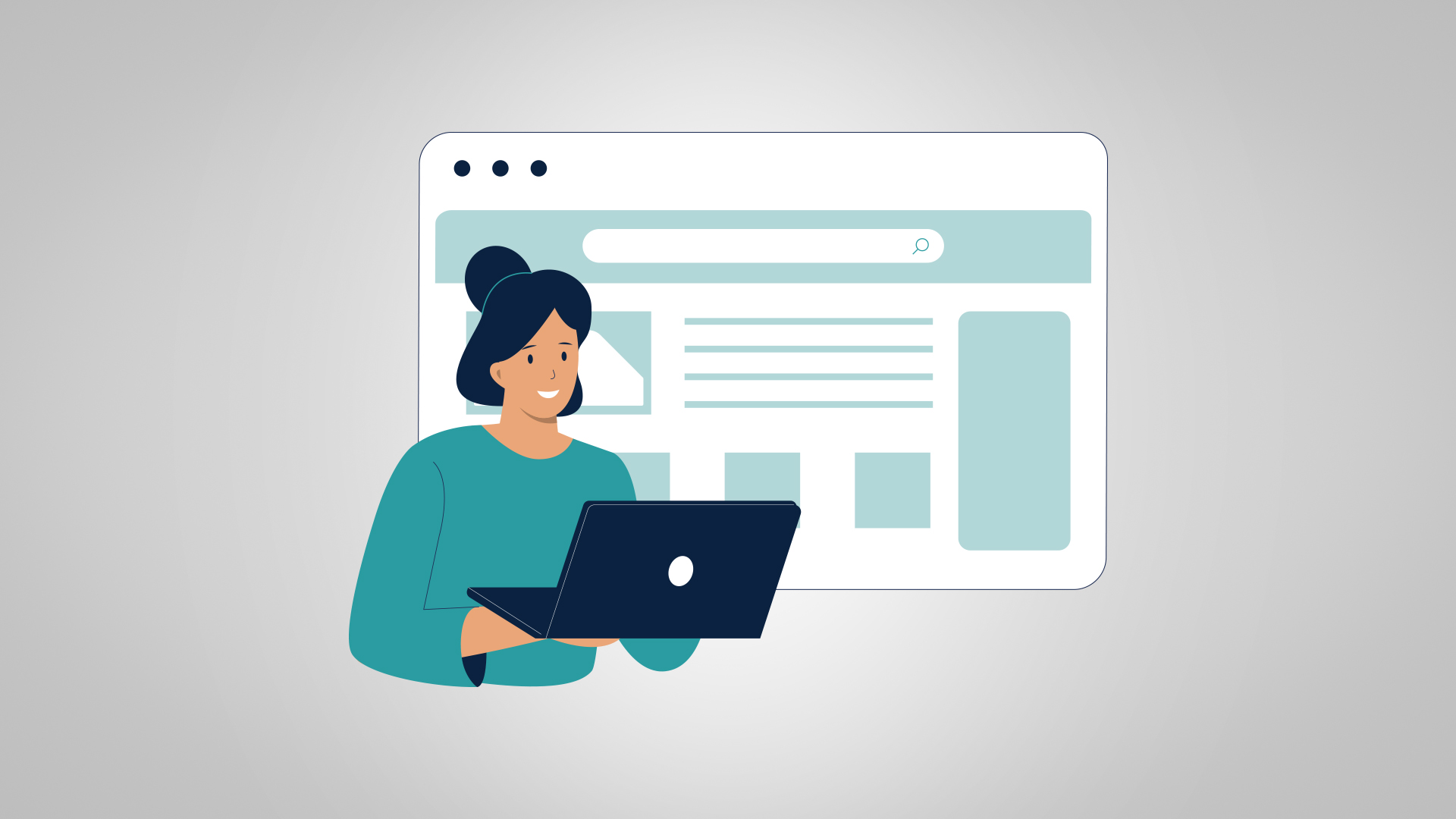
1. Keep it simple and use white space
The instinct on most sites is to add more. More graphics, more sections, more animations, more pop-ups asking the reader subscribe before they’ve read a word. Resist it. A simple page lets the reader focus on what matters. White space, the breathing room between your design elements, is part of that simplicity. It gives the eye somewhere to rest and signals confidence in your message. A page that fills every pixel feels frantic; a page with room to “breathe” feels intentional.
2. Group related information
People scan websites the same way they scan a grocery store. They look for the section that holds what they need, then they look within that section for the specific thing. A site that puts pricing under “Resources,” services under “About,” and case studies in three different places is asking the visitor to do work that should have been done for them.
Search engines and AI engines work in similar ways, just faster. They crawl your site looking for clear topical clusters, signals that this page is about one thing and that page is about another. Strong information architecture (the structure of how your content is organized and connected) helps both groups find what they came for.
A few things that tend to work: keep your main navigation to five or six items, group secondary pages under their parent topic, and put related pieces of content close to each other on the page itself. Service pages should link to relevant case studies. Pricing should sit near the testimonials that reenforce it. The contact form should appear in the places where a visitor is most likely to feel ready to act, not just on a separate “Contact” page they have to hunt for.
3. Use imagery that reflects your company
Stock photography has that “look,” and we all recognize it. You know, anyone looking a little too happy or into whatever they’re doing on the job. These images don’t say, “Hey, we’re a serious company, so you can take us seriously.” They say, “We have a Shutterstock subscription.”
Good imagery on a website should do at least one of three jobs: show what you actually sell, introduce the people behind the work, or help a visitor see themselves as your customer. If a photo isn’t doing one of those, it’s probably taking up valuable page real estate a more useful element could fill. That includes the hero image on your homepage, which is often the worst offender.
The investment matters here. A custom photo shoot of your team, your facility, or your product in use is worth more than a hundred stock images, and it pays off for years. If a full shoot isn’t in the budget right now, even a few well-lit phone photos of the real thing tend to outperform polished stock. Your visitors aren’t looking for perfection. They’re looking for proof that there’s a real business with real humans on the other end of the URL.
4. Use color with intent
Color is one of the first things a visitor processes, often before they’ve read a single word. It’s also one of the most underused tools on most websites. Brands pick a palette during a logo design exercise, slap it across the site, and never think about it again.
A more thoughtful approach starts with the question of what each color is doing on each page. Your accent color, for example, is doing the most work. It should appear on the buttons, links, and elements you want people to click. The moment you start using your accent color decoratively, you’ve trained your visitors to ignore it.
Your color palette’s tone matters as well. A pediatric clinic and a personal injury law firm have wildly different jobs to do emotionally. The clinic needs warmth, softness, and reassurance. The law firm needs gravity, confidence, and seriousness. If both sites use the same bright, cheerful palette, one of them is sending the wrong message at the worst possible moment.
5. Design for mobile first
More than half of all web traffic now comes from a phone. (It’s also the version of your website search and AI engines crawl first.) If your site looks great on a desktop and falls apart on a six-inch screen, you’re delivering a bad experience to most of your audience. Mobile-first design means starting with the smallest screen and working up, not the other way around. It forces you to make hard choices about what matters, because there’s no room for filler.
Test your site on your own phone often. If you find yourself pinching and zooming to read, your customers are doing the same thing – and getting just as frustrated.
6. Make your calls to action obvious
A good website experience guides the reader toward a next step. A great one makes that step impossible to miss. Every important page should have a clear call to action: a button, a form, a phone number, something that tells the reader what to do next. Skip the clever copy. “Schedule a Consultation” beats “Let’s Connect and See Where the Journey Takes Us” every time. Use a color that stands out and place it where the eye naturally lands. Also, make sure the language matches the action the visitor is taking.
7. Display trust signals
People do not give their information, time, or money to brands they don’t trust. Your website plays a critical role in earning it. Trust signals include:
- real customer testimonials with full names and photos
- recognizable certifications or partner logos
- case studies with specifics
- security badges on checkout pages
- team photos that show the humans behind the brand
Place these strategically near the moments where a visitor might hesitate: pricing pages, contact forms, checkout flows. The goal is to answer the unspoken question, “Can I trust these people enough to give them my money?”
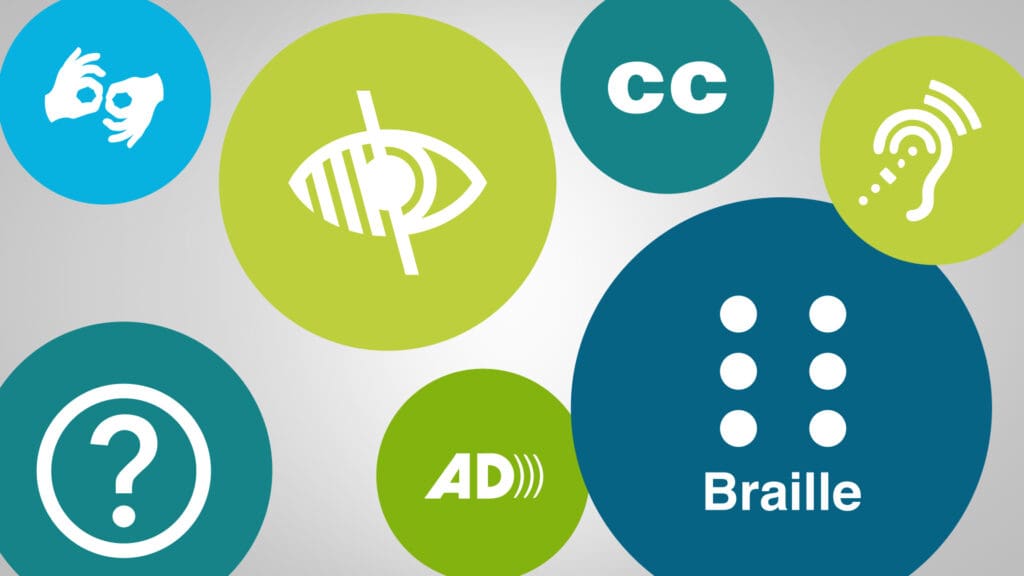
8. Build for accessibility and speed
A site that loads slowly or fails for users with disabilities is delivering a bad customer experience, full stop. Accessibility means real alt text on images, proper heading structure, sufficient color contrast, and content a screen reader can parse. Speed means compressed images, clean code, and a hosting setup that doesn’t choke under load. These aren’t nice-to-haves anymore. They’re part of the experience, and they affect who sticks around and who checks out your competitor instead.
Ready to Improve Your Website’s Customer Experience?
A good website customer experience is the result of dozens of small decisions, made by people who took the time to think about the audience on the other end. The strategy, the content, the imagery, the color, the speed, the trust signals: all of it adds up to whether a visitor feels like the brand on the other side of the screen sees them as a person or as a conversion.
If you’re staring at your own website and wondering where to start, that’s a good place to be because it means you’re paying attention. PriceWeber has been helping regulated businesses in healthcare, financial services, and manufacturing navigate their website customer experience challenges for years. We’d love to help you, too.
Or, call us at 502-499-4209 to talk with one of our experts today.
KEY TAKEAWAYS
- Your website customer experience is often a buyer’s first real interaction with your brand, and they’ve formed an opinion before they ever talk to sales.
- Strategy comes before design. A site that delivers a real customer experience starts with content strategy that maps to what your audience needs at each stage of their decision.
- Write for scanners first. Almost nobody reads a webpage start to finish, so use clear headings, short paragraphs, bold phrases, and visual breaks to help the eye move.
- Simplicity and white space, grouped information, intentional imagery and color, mobile-first layouts, clear calls to action, and visible trust signals all shape how a visitor feels about your brand within seconds.
- Accessibility and speed are part of the customer experience now. A site that loads slowly or fails for users with disabilities is losing customers before the content has a chance to do its job.
- Customers can tell when a company sees them as a person versus a conversion, and that perception drives whether they buy, return, and recommend.
Our Articles Delivered
Signup to receive our latest articles right in your inbox.