
Mobile SEO: 6 Ways to Future-Proof Your Website and Enhance User Experiences

Pinch. Tap-tap. Swipe. Spread. Tap. A new take on Morse code? A video game character’s ultimate move sequence? Slightly naughty dance moves? Nope. Just some typical user behavior when interacting with a mobile version of a website. Over 60% of searches happen on a smartphone, which is why Google switched to mobile-first in 2016. As nanotechnology and responsive artificial intelligence continue to advance, the proportion of desktop searches is flatlining while searches from mobile continue to rise. So, how mobile-friendly is your website?
In this edition of Plain Talk, we’ll reveal six ways to future-proof your website and enhance user experience (UX) with mobile SEO.
- Improve Page Load Speed
- Enhance Mobile-Friendly Design
- Produce Engaging Mobile Content
- Meet Evolving User Expectations
- Seamlessly Integrate Voice Search Queries and AI
- Incorporate Local SEO
- Get Expert Help With Mobile SEO
1. Improve Page Load Speed
As you’re probably acutely aware, faster site speed has a significant impact on user satisfaction. We’ve all experienced waiting for a webpage to load after clicking on a search result. A mobile-friendly website that quickly appears on the screen satisfies user expectations and provides an ideal mobile experience.
In the land of search engine optimization, loading speed can have an effect on metrics such as bounce rates, click-through rates (CTR), and user engagement. Websites with slow loading times tend to have high bounce rates, which means visitors leave quickly, harming conversion chances. On the other hand, a well-optimized website with fast page load times encourages users to explore different parts of the site, leading to longer interactions.
Before optimizing page speed for mobile devices, look to tools like:
These provide a treasure trove of insights, from the behavior of visitors coming from organic traffic on mobile devices to specific issues affecting loading speeds. Elements within your website design and performance, like browser caching, HTML structure, redirects, JavaScript, and CSS, can all impact page loading, and these data and testing tools can help pinpoint issues.
2. Enhance Mobile-Friendly Design
The significance of a responsive web design can’t be overstated. Again, consider your own frustrations with encountering mobile pages that are anything but. How many times have you tapped on a search result only to be taken to a teeny tiny desktop version of a website? Websites must seamlessly adapt to different screen sizes, including the smaller screens commonly encountered in mobile devices. By effortlessly adjusting layout and content, responsive design ensures a harmonious and visually enticing encounter, regardless of the device at hand.
Navigation
Effective mobile optimization involves tackling navigation intricacies on small screens. Navigating a website on a phone using fingers instead of a keyboard and mouse is no small feat. It demands design precision and coherence. This includes:
- Consistency across sections and pages
- Intuitive, easy-to-find menus
- Clear, user-friendly labels icons
- Thoughtfully positioned call-to-action buttons
Forms
Some online forms can make you feel like you’re all thumbs. But when they’re thoughtfully designed with larger, touch-friendly buttons and input fields, users find them much easier to fill out. This streamlined interaction enhances user satisfaction and encourages higher form completion rates, ultimately leading to a positive user experience and more digital marketing goal completions.
Pop-ups
As long as the internet is free to use, you can bet there will be no shortage of these annoying little devils anytime soon. However, a responsive design helps reduce the problem of the way pop-up ads affect mobile sites. With the right design, they can have less of an effect and ensure users can browse smoothly without interruption.

Schema markup
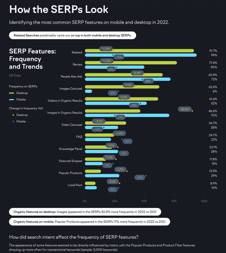
These days, Google isn’t looking to outperform another search engine. It’s looking to take on Amazon. In 2022, the Popular Products feature appeared in more than 25% of search queries on mobile, which may indicate it’s a growing source of revenue for the company. If you’re in an e-commerce business, how do you get Google to feature your products with so many people shopping using their mobile devices? By incorporating schema markup into your web pages. Schema markup is code added to a website’s content that provides search engines with specific details about the information on the page, helping them display more relevant and informative search results.
These elements all work in conjunction to create a seamless browsing experience for your visitors, enhancing your website’s mobile usability and, therefore, user attention. (Which then leads to better user attention, more time on your website, and—ideally—better conversion rates. You get the idea.)
3. Produce Engaging Mobile Content
Consider your target audience when creating mobile-friendly content. People are busy. That means shorter attention spans and need-it-now expectations. By understanding these mobile user nuances, you can adapt your content to capture attention quickly and provide value efficiently. This approach ensures that the information isn’t overwhelming. Instead, it’s presented in easily digestible pieces that your audience can quickly grasp. Here are some elements to consider adding when crafting content:
- Optimize title tags and headings for top landing pages and blog posts, ensuring they are concise, impactful, and immediately convey the content’s essence.
- On-page, present snippets of information in easily digestible formats such as bullet points, numbered lists, brief paragraphs, and headings.
- Utilize visually captivating elements, including images, videos, and infographics. Make sure these are designed to be responsive and will adjust based on screen size.
However, it’s not solely about appealing to your audience. Content designed for mobile traffic also has a significant impact on how search engines, like Google, perceive your website. When your content is thoughtfully structured for mobile users, it can actually enhance your Google ranking and present opportunities to appear in Rich Snippet results. This means your website may have a higher likelihood of appearing closer to the top (or at the very top!) in search rankings when people search for related topics.
4. Meet Evolving User Expectations
Staying on top of shifting user expectations is a cornerstone of effective mobile SEO and future-proofing your web presence. As user behaviors and preferences shift over time, it’s crucial to adapt your design and content approaches to meet their changing needs. Mobile searchers now expect seamless and relevant experiences. They may even use different devices at different stages of the buyer journey.
For example, people will often turn to desktop computers for in-depth product research before ultimately making the purchase from their phone. This means your website’s mobile-friendliness and content must align with what users are seeking, no matter when, how, or where they’re seeking it. This responsiveness to shifting trends can significantly impact the ranking factor on search engine results pages (SERPs) by catering to what users are looking for in the mobile context.
Stay consistent
You read that right. The best way for your business to adapt to changing user expectations? Stay the same. Consistency is key when it comes to providing a satisfying UX across devices. With many users switching between desktop and mobile platforms, ensuring that your content is consistent and readily accessible regardless of the device they use is essential. A user who finds your website easy to navigate and visually appealing on their desktop should encounter the same level of satisfaction with your site’s mobile performance.
This uniformity not only enhances user trust but also supports your mobile SEO efforts. When both mobile and desktop users have positive interactions with your site, it sends a positive signal to search engines about the overall quality and relevance of your content.
5. Seamlessly Integrate Voice Search Queries and AI
With the rise of voice-activated assistants like Siri, Alexa, and Google Assistant, optimizing your content for voice-based queries and commands is a great way to increase your mobile rankings with organic search. Don’t always go for the short, one- or two-word queries. Think outside the box while doing keyword research. Incorporating conversational language and long-tail keywords that mirror how people naturally speak can improve your chances of appearing in mobile search results.
Leveraging AI-powered interactions can take user engagement to the next level. AI-driven chatbots and virtual assistants can provide instant responses to user inquiries, enhancing the overall user experience on your site. These interactions not only cater to the needs of mobile users seeking quick and relevant information but also contribute to personalized experiences. AI can analyze behavior and preferences to deliver tailored recommendations and content, making visitors more likely to stick around and explore your products and services.
6. Incorporate Local SEO
With the continuing rise of remote work and faster, better connectivity, on-the-go lifestyles are here to stay. If you have a product or service that benefits from “near me” searches, optimizing for local search should be part of your mobile SEO strategy. Here’s why:
- Personalized and relevant: By focusing on local searches, you can give people information that’s specific to their area. This makes them feel like you understand what they need and makes their experience more helpful.
- Faster decisions: When someone is using their phone to find something nearby, they usually want the information quickly. By having good local search optimization, you can give them the details they need fast, helping them make decisions faster.
- Trustworthy: Showing up in local search results and having positive reviews can make people trust your business more. This trust is really important online, and it can make users more likely to choose you over other options.
- Smooth experience: When your local and mobile strategies work well together, users can smoothly go from looking at your website on their phone to visiting your physical store. This makes things easy for them and leaves a good impression.
- Beating the competition: Using local search optimization on mobile sets you apart from other businesses. It shows that you care about your local customers and understand their needs better, which can give you an advantage.
Get Expert Help With Mobile SEO
The digital world changes rapidly, and user behavior with it. In order to future-proof your online presence, you have to look beyond a simple website and keep up with the changes. Start thinking in terms of how people are using their mobile devices to find information and make purchases. By embracing responsive design and optimizing for different devices, you align with search engine algorithms that prioritize mobile-friendly experiences. Have questions about your mobile SEO? Send us a message or give us a call at 502-499-4209.
Our Articles Delivered
Signup to receive our latest articles right in your inbox.